According to Netcraft’s Web Server Survey, there were over 1.5 billion websites at the start of the year. Fear not, though, because only 10-15% of those are active. However, it is estimated that about 380 websites are created every minute! This is very scary for anyone who intends to create their own website as they have to compete for eyeballs. The result has been an impatient audience who will quickly look away after only a glance, which is why it is so important to select your typography carefully. When properly executed, you can turn casual browsers into actual customers for your business. While typography is not the only consideration, these 7 trends will help you receive more attention from visitors.
Serifs
These are among the most commonly used fonts, so it should not be surprising that they are still trending in 2019. They are generally classified into serifs and sans-serifs whereby the former has tiny lines at the end of strokes to add a bit of flair. The latter type of serifs (sans-serifs) does not have these lines. There was a time designers believed that serifs were less readable, and the font became less common. Today, this belief has been proved to be a myth and the font is coming back in 2019. This is partly because of better screen resolutions that make distinguishing between letters easier. In fact, today some of the serif subgroups are among the most common fonts on the internet. Some examples of serif fonts include Times New Roman, American Typewriter, Didot, Centaur, etc. While sans-serif fonts include News Gothic, Helvetica, Ariel, Gill Sans, Futura, etc.
The advantage to serifs is that they are so comfortable to the eye that they make for good official content. If your website contains a lot of text, you should consider serifs because they make good use of space. This is especially useful when designing for mobile devices with smaller screens. Besides, there are many types to choose from, making variation easy without seeming comical. Just make sure to pay attention to the spacing between letters, ascenders, descenders to accommodate the serifs so that every word is legible.
Animated fonts
Web design has come a long way since the first website went live in 1991 – now text can change dynamically. Dynamic fonts mean that the font can change in shape, color, width, and height or change completely into another font. The change can be automatic upon opening the website or triggered by user interaction with their devices such as pointing the mouse or scrolling. This also creates a play on balance and consistency to create animation, even when the letters aren’t necessarily ‘changing’ or ‘moving’.
What animated fonts do is catch a reader’s attention and break the monotony of static text. First, it differentiates your website from the rest and allows more freedom to the designer to apply different fonts and make the text more interactive. Nevertheless, you have to be careful when using animated fonts not to make it too gimmicky. Also, remember to consider the speed of animations carefully so that the text still remains readable even at a glance.
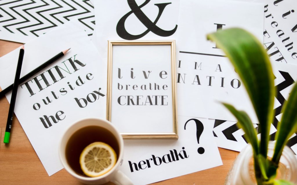
Handwritten fonts
If you really want your website to stand out, why not try custom fonts? Handwritten fonts are the ultimate way of creating uniqueness in your design, but it can be costlier than other fonts as you would have to hire a typographer. If you’re lucky to have one on the team or are one yourself, then you can try to induce some creativity. They are great to look at and instantly create an impression on the reader, making them ideal for promotional content. At Website Design SketchCorp, you can get your own custom handwritten font to use across your website and stand out completely from the rest.
3D fonts
This has been another advent of technological advancement, but it does pack a punch. Immediately upon opening a webpage with 3D fonts, the text pops up at them, so this should be your choice if that is what you want. With 3D, you can take any font type available and distort it into whatever you desire and then alter colors, length, width, etc.
Needless to say, this is best for creative websites where you really want to catch the visitors’ attention. Newer technologies such as AR and VR make it even possible to make these fonts to be actually ‘felt’. Now, that’s really pushing the boundaries.
Brutalism
Talk about making a statement, nothing does so more than the in-your-face-ness of brutalism. This is the kind of font to choose if you really want to push the rules right to the edge. You will commonly see brutalism in posters and experimental art because it instantly grabs a person’s attention. To avoid being too much for the reader, try to complement the brutalist text with symmetrical images. Do not also let the actual piece of text take the center of the screen because that may be a bit too much. Instead, position it a bit to the side or halfway in the middle where it can command attention without overwhelming the readers.
Vintage and retro
They say what goes around comes around, so why not create your own bit of nostalgia? Vintage fonts have always been admired by readers because they look handwritten and classy. Thus, it’s no wonder that several companies such as Vogue chose these fonts and stick to them.
Overlaying and colors
You often see the overlaying of text on images or vice versa on memes in social media and it works just as well with websites. This form of typography does not inhibit you from selecting different fonts for the text, and it does allow you to give text life through the images. As a result, overlaying is a chance to bring out the creative side and make something eye-catching.
Apart from that, playing with colors is also a good way to make text pop out and exciting. It is also easy to work with gradients, textures, and animations with these typefaces and truly create something special.